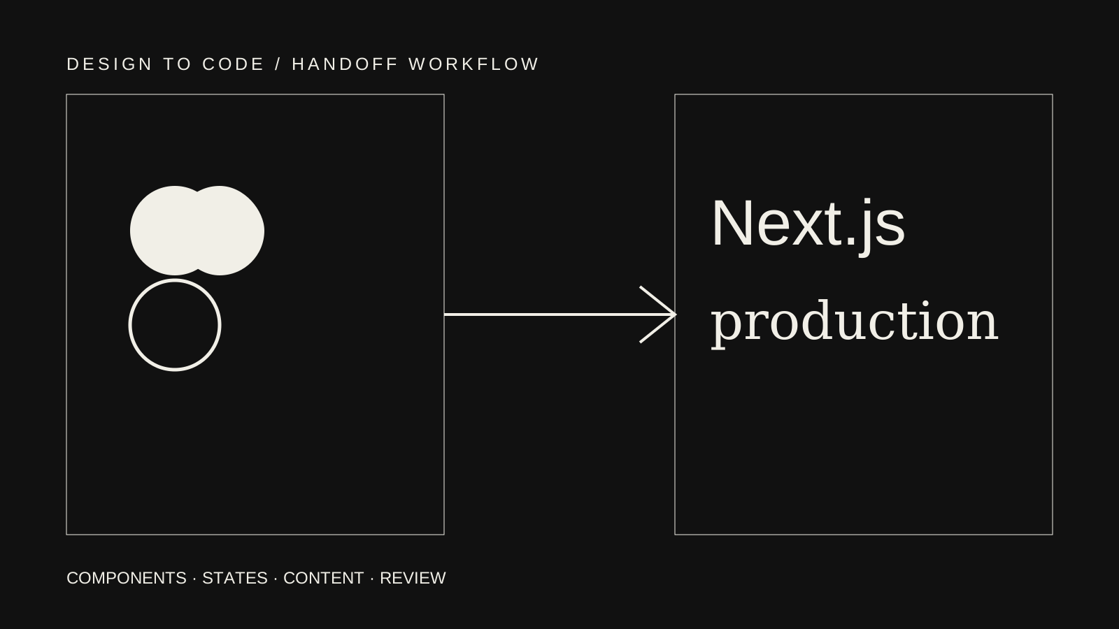
A good Figma handoff does not ask a developer to copy pixels from a canvas. It explains the visual system, shows important states and gives the team a shared method for resolving what the design file cannot fully specify.
Next.js implementation adds content structure, routing, rendering, accessibility and responsive browser behaviour. Those concerns should influence handoff before every desktop screen is declared finished.
This workflow helps designers, clients and frontend developers move from approved direction to a maintainable implementation without turning the design file into an impossible specification.
Begin with routes and content types
Before mapping components, list the routes and repeatable page types. A homepage, service template, article template and case-study template have different content and metadata responsibilities.
For each route, record:
- Purpose and primary action
- Required content fields
- Repeatable or one-off status
- Public or authenticated access
- CMS ownership
- Important metadata
- Related navigation state
- Empty, error or unpublished behaviour
This connects the design to the Next.js route structure and prevents missing utility states from being discovered during launch week.
Identify the design system actually used
Figma libraries often contain experimental components and old variants. The handoff should identify which tokens and components are approved for this project.
Review:
- Type styles and fallback behaviour
- Colour roles rather than isolated hex values
- Spacing patterns
- Grid and container rules
- Buttons, links and form controls
- Cards and content sections
- Navigation variants
- Icons and illustrations
- Motion principles
Developers should not convert every Figma layer into a component. A component is useful when a pattern repeats, carries behaviour or needs controlled variants. Decorative wrappers do not automatically deserve an API.
Map Figma components to frontend components
Create a small mapping between design names and implementation responsibilities.
For example:
- “Button / Primary” maps to a link or button depending on the action
- “Card / Case Study” maps to a reusable content component with image, category, title and summary
- “Section / Split” maps to a layout pattern, not one fixed content block
- “Navigation / Desktop” and “Navigation / Mobile” map to one navigation system with responsive states
Document required variants and remove variants that are not used. A component with twenty theoretical combinations creates more work than a smaller component that reflects real page needs.
The frontend development service covers design-to-code implementation, component systems, responsive behaviour and accessibility beyond a specific framework.
Provide responsive rules, not only frames
Desktop and mobile screenshots show two outcomes. They do not explain what happens between them.
Specify rules such as:
- Container maximum width and side padding
- When columns stack
- Which content changes order
- How navigation transforms
- Which elements wrap or scroll
- Maximum readable line length
- Image crop priorities
- Behaviour for long headings
- Touch target expectations
Tablet designs are useful for complex layouts, but a written rule can be more valuable than dozens of fixed-width frames. The developer must implement a continuous system, not a slideshow of artboards.
Use realistic content before handoff
Placeholder text hides layout problems. Test components with the longest expected heading, a missing image, a short summary and an unusually long category name.
For CMS-driven pages, share the content model alongside the design:
- Required and optional fields
- Character guidance where it protects layout
- Relationships between entries
- Image ratios and focal points
- Rich-text capabilities
- Slug and metadata ownership
The frontend should not silently assume every field exists. Optional content needs an intentional layout state.
Design interaction states
Every interactive element has more than a default appearance. The handoff should cover relevant states:
- Hover
- Keyboard focus
- Active or selected
- Disabled
- Loading
- Empty
- Success
- Error
- Expanded and collapsed
A form with only default inputs is incomplete. The developer otherwise has to invent validation, focus and confirmation behaviour while implementing business logic.
State documentation does not require a separate frame for every combination. Component properties, concise notes and a prototype can communicate the intended system.
Include accessibility in the design decision
Accessibility is shared between design, content and development. Designers influence contrast, focus visibility, target size, reading order and information that cannot rely on colour alone.
The handoff should identify:
- Logical heading structure
- Visible focus treatment
- Labels and error placement
- Reading order when layouts change
- Alternative text responsibility
- Decorative images
- Reduced-motion behaviour
- Keyboard expectations for custom controls
The developer then implements semantic elements and interaction behaviour. An automated checker is helpful but cannot replace keyboard and content review.
Prepare assets deliberately
Agree which assets come from Figma and which belong in the CMS. Export icons as suitable vectors, provide original raster images at useful dimensions and avoid embedding essential text inside images.
Record:
- Filename and intended use
- Aspect ratio
- Crop behaviour
- Light or dark variant
- Decorative or informative purpose
- Compression responsibility
Next.js image handling still requires correct dimensions and appropriate source files. Optimization cannot restore detail that was removed by an undersized export.
Align the handoff with Next.js architecture
The design should not dictate server and client boundaries, but the developer needs enough behaviour context to make those decisions.
During technical review, discuss:
- Which routes are content-driven
- Which components need browser state
- CMS preview requirements
- Personalised data
- Forms and server actions
- Third-party scripts
- Metadata and social images
- Loading and error boundaries
The Next.js development service explains how routing, rendering, CMS integration and metadata are handled as part of the website rather than as visual design details.
Run a handoff review before development starts
Hold one focused review with design, product and frontend ownership present. Walk through one complete user journey and one repeatable content template.
Record open questions in a shared location. Assign an owner and decision date. Do not leave important clarification inside scattered Figma comments that may be resolved without a durable record.
Useful review questions include:
- Which screen is authoritative when variants conflict?
- What content is still provisional?
- Which interactions are required for launch?
- What can the CMS editor change?
- Which components are shared with an existing product?
- Who approves responsive adaptations?
Build a representative vertical slice
Before implementing every page, complete one representative route containing typography, responsive layout, media, navigation and at least one interactive element.
This tests whether design tokens, component conventions and review environments work. It can reveal that a font loads poorly, a spacing scale lacks intermediate values or a CMS field cannot support the intended layout.
Correcting the system after one route is less expensive than correcting twenty completed pages.
Review implementation by behaviour
Visual comparison matters, but review should also include:
- Keyboard navigation
- Focus order
- Content at intermediate widths
- Long and missing content
- Loading and error states
- Image loading and layout stability
- Real links and navigation
- CMS preview and publishing
- Reduced-motion preference
The goal is not to make browser rendering mathematically identical to a static file. It is to preserve the design intention within a robust, responsive system.
The Made By Bytes Next.js case study provides a relevant Next.js project reference in the existing portfolio, while claims remain limited to recorded project data.
A practical handoff checklist
Before development begins, confirm:
- Approved routes and page types
- Current component library and tokens
- Responsive rules
- Realistic content and CMS fields
- Interaction and form states
- Accessibility notes
- Export-ready assets
- Metadata and social-image ownership
- Technical constraints and integrations
- Shared review environment
- Open-question log with owners
- Acceptance criteria for launch
Conclusion
A reliable Figma-to-Next.js handoff turns visual decisions into a shared implementation model. The strongest handoffs leave room for developer judgement while making business-critical behaviour explicit. Teams still deciding on the frontend foundation can use the React vs Next.js guide before finalising framework-specific handoff details.
If you need design-to-code implementation, explore frontend development services, review the Next.js delivery scope, or send the design and project brief.
Frequently asked questions
Does every Figma layer need to become a React component?
No. Components should represent repeated patterns, controlled variants or behaviour. Turning every visual wrapper into a component creates unnecessary abstraction.
Should designers create every responsive breakpoint?
Not necessarily. Provide key layouts and clear rules for stacking, ordering, wrapping and content priority. Complex transitions may still need additional frames.
Who decides loading and error states?
Product, design and development should agree on the behaviour. The developer can recommend technical patterns, but user-facing messages and recovery paths are product decisions.
Can development begin before every page is designed?
Yes, when the core system and a representative route are approved. Unresolved page-specific requirements should remain visible rather than being assumed.